How can we visualize real distance in the Mercator projection?
All maps are distorted. But how much?
Mouseover the map to see how the size of a 500 miles radius circle changes according to the distortion of the Mercator projection.
A map projection is a systematic transformation of the latitudes and longitudes of locations from the surface of a sphere or an ellipsoid into locations on a plane. As all map projections necessarily distort the surface of the world in some fashion, the cartographer's decision on *what* and *how* to design it are based in a desired functionality and immersed in a specific geopolitical context.
The Mercator projection is the most used projection today. It was created by the Flemish geographer and cartographer Gerardus Mercator in 1569. It became the standard map projection for european nautical purposes. Although the linear scale is equal in all directions around any point, the projection distorts the size of objects as the latitude increases from the Equator to the poles, where the scale becomes infinite.
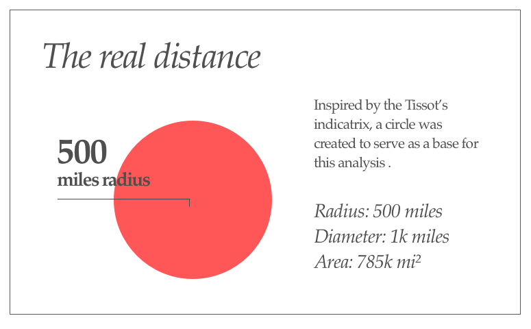
In 1871, looking to characterize local distortions due to map projection, French mathematician Nicolas Auguste Tissot developed the Tissot's indicatrix. It consists in a mathematical contrivance to describe the distortion of a map at a single point.
Inspired by Tissot's idea I created this interactive map in order to visualize real distances (in this case a radius of 500 miles) in the Mercator projection. With that, we can easily analyze its distortions.
Just mouseover the map and try it yourself!
created by Ilana Bonder
www.ilanabonder.com